 button when selecting the
month option on the top of the dashboard
There are three methods to view the detailed data:
- Viewing Detailed Poor Call Data in Table Format
- Viewing Detailed Call Data in Prioritized List Format
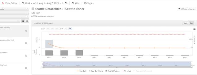
The History of Poor Calls chart displays the poor calls over the specified period of time based on the call scenario filters. The data will be displayed based on time frame selected by the user.
To display the data by daily trend of poor calls, use the
 button when selecting the
month option on the top of the dashboard
When the week time period is selected at the top of the
dashboard to display the data by day use the  button.
NOTE:
The dashboard will display the data based on the time period selected using the button at the top of the dashboard.

The data collected, retained by PowerSuite by day displays a month worth of data. However up to 30 day worth data can be viewed when selecting older dates.
- When the time period Month is selected ,12 months of data can be viewed.
- When the time period Week is selected, 30 days data will be displayed.
Example:
When time period Week of Aug 1 – Aug 7 2021 is selected and choose Day in the display trend, below history of Poor Calls will be generated

You can hover over the data points in the chart to view data information.