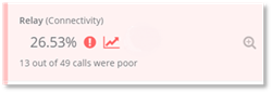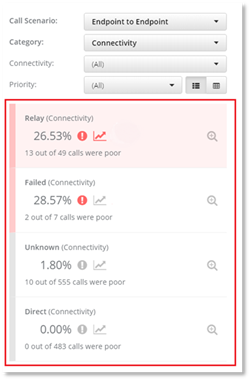
The Poor Call cards are displayed on the left-hand side of the dashboard. They are displayed in order of Priority – high medium and low. The priority is calculated by PowerSuite based on the filters used to drill down the data. The poor call card is colored with the priority color that PowerSuite has calculated. The Poor Call card details:
- The number of calls that were poor and shows the percentage, Volume, Total and Indicators that are color coded.
The call card details:
- The percentage of calls that were poor based on the filters selected (poor %).
- The indicators.
Click on the KPI card to display the information from the
poor call card in a chart and click on to display granular information of the poor
calls.
to display granular information of the poor
calls.