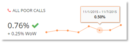
Select the All Poor Calls KPI card, to display the poor call scenarios for the time period selected.
The Poor Call page displays a breakdown of the most important and actionable poor call scenarios, providing information in the following column headers:
- Actual
o The actual KPI percentage is the Poor Call percentage for all calls that are classified for the call scenario.
- Target
o The target KPI percentage is the configured poor call threshold for the call scenario.
High level Indicators are also displayed. These indicators provide a quick high-level view displaying if the actual poor calls have broken the threshold for the call scenario.
Selecting the KPI card, additionally displays a chart with the selected poor call scenario, displaying the poor calls percentage over time for the specified call scenario.
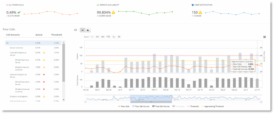
Some of the scenarios will display a breakdown list of the variables of the scenario on the right hand side of the chart or map. Selecting these breakdowns will navigate you to the Operations Dashboard.
The data in Service Health by default is displayed per month or week dependent on the time period selected.
To display the data by day to show the daily trend of
poor calls when the month time period is selected at the top of the dashboard,
use the button  . When the week time period is selected at the
top of the dashboard to display the data by day use the button
. When the week time period is selected at the
top of the dashboard to display the data by day use the button  .
.
NOTE:
The button displayed in the dashboard will depend on the time period selected at the top of the dashboard. The data collected, retained, and displayed by PowerSuite by day is limited to a maximum of 30 days from today.
- When the time period Month is selected the only daily data displayed will be 30 days from today.
- When the time period Week is selected, only data 30 days from today will be displayed. If a week in the past is selected less data will be displayed in the chart.
Example:
If today is August 11th and the current week is selected all 30 days data will be displayed. If the week ending August 4th is selected only 21 days of data will be displayed, as PowerSuite on retains 30 days of granular data.
You can hover over the data points in the chart to view data information.