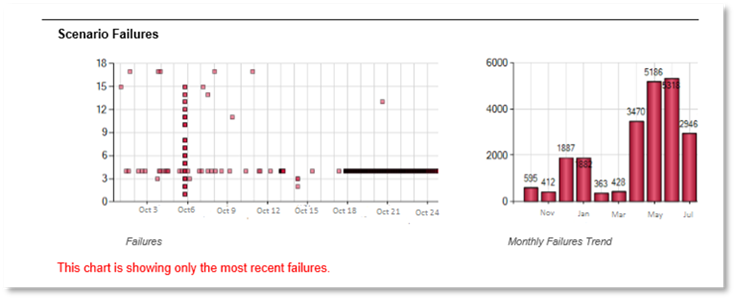
The Scenario Failures section of the PowerSuite Monitoring Solution report is a powerful mechanism to identify certain failure hotspots, in addition to viewing the trend of the number of failures over a longer period.
The chart, above is used to identify which Scenarios (identified via the Y Axis) have had independent failures over the course of time (identified via the X Axis). Every independent failure of each Scenario is identified via a red dot. The second chart shows the number of unique failures per period (weekly or monthly) allowing a trend of number of failures to be seen. In the example above, in the chart on the left it can be seen that a number of failures occurred throughout the period with some Scenarios failing more often than others. It can be seen that on Oct 6 there was a significant failure which impacted many Scenarios concurrently. This is shown in the vertical line of red dots on Oct 6. The chart also indicates that the failure was something significant that had wide ranging impact, for example Lync or Skype for Business Edge Servers not being available. In addition, it shows that a Scenario had a significant length failure on Oct 18 to 24, this is identified with the horizontal line of red dots on Oct 18 to 24. It indicates that there were failures that likely only impact that particular Scenario, for example, the relevant pool not being available or the associated gateway failing.