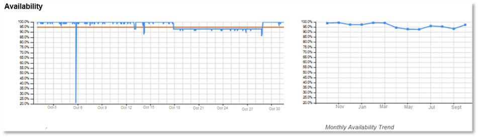
The Availability section of the Monitoring Solution report breaks down availability into two different charts. The first chart as shown below is a higher fidelity on the availability broken down per day across the associated period (weekly or monthly).
Where:

The second chart on the right shown above illustrates the trend of availability over a longer period of time (several weeks or months). The Availability section enables:
- Improvements to be viewed over time.
- Understanding where potentially there was a significant degradation in overall availability.