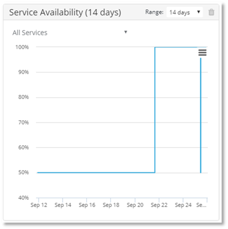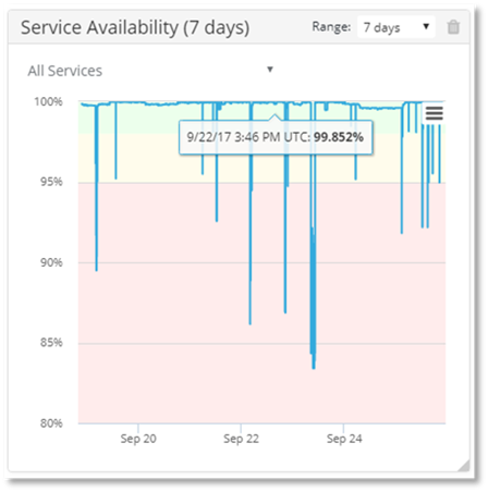
The default color of the charts is blue. If major incident thresholds for your organization have been configured in PowerSuite Monitoring Solution, then the display will be colored to display the applicable thresholds.
Example of chart without Monitoring Solution thresholds set:

Example of chart with Monitoring Solution thresholds set:

Example of Service Availability Chart with thresholds not set:

Example of Service Availability Chart with thresholds set:
